Evaluating

I feel like I may have compromised a lot of my original intentions. For example, I said I would only use large, full-page images nor have any reference to a magazine or your everyday life whatsoever.
However, there is still a slight glimmer of evidence that these ideas remain. The majority of my images are, the above mentioned, full-page ones and a lot of my magazine is extremely distant from the norm.

But, these initial wants are ideas that were built on no foundation and were exactly that: ideas.

I think it was great to want to create something completely original and new, but in the production of it you see that it may not have worked.
I mean, the reader needs to be comfortable. They cannot simply dive bomb into a parallel world of adventure and be expected to really get it. I can go on the internet and see a picture of Hong Kong’s beautiful islands but am I really appreciating it? No. I am merely observing it and what I needed my magazine to do was to force that state of relaxation, subjectiveness and receptiveness to allow the reader to open themselves and truly experience ‘Food and Travel’.

Ultimately I have had to compromise some of the magazine’s gimmicks to ensure I do not compromise the magazine’s effect.

Food & Travel Magazine (Printed)

IMG_1836 - Copy

Get Comfortable. Get Lost: The Perfect Sunday Morning

When I got in from Uni, my magazine was at home waiting for me. I had got the sleeve printed elsewhere and had it ready to go. I ensured that they fit perfectly and when you remove the magazine from the sleeve, it makes a lovely “shhhhwoop” sound. The experience is already starting.

I immediately thought I should photograph it and so I put a cup of coffee next to the magazine, to demonstrate it in it’s ideal situation.

I did notice one slightly bitmapped image on the contents page but this is something I couldn’t have identified until now. The image is a texture and on screen and quarter size print it was fine. Even the dpi was 150, so I couldn’t predict that would have happened.

There is a beautiful depth to the “show-through” I mentioned before. Especially on the Main Feature’s title page, you can see the fish show through and there is something tantalisingly teasing about it.

Below is a gallery including my printed spreads:

Justifying My Decisions: Overall Design

This post may repeat a few of the points I have previously mentioned, but it is intended to briefly summarise ALL the decisions I made throughout the development of the idea and production of the magazine…

  • Audience
    I never wanted to change my audience. The magazine’s content is directly aimed for a specific target: rich, potential retirees, with the desire for adventure.
  • Function & Concept
    I really just wanted the magazine to enable the reader to experience this adventure through exploration and senses. The existing magazine wasn’t a million miles away, there were just so many reminders and distractions in there, not allowing you to actually ‘Lose yourself.’ This was my concept and so the function, naturally, followed from this.
  • Form
    I mentioned before that the form would be that of a newspaper. The original idea of a small, portable magazine was flawed. I want the reader to get lost within the pages and, in a way, shut them out from their lives for a while.
    In finding somewhere to print the magazine, I realised that there were a lot of specifications to observe. These included colour profiles, image quality, page size and other things. But the most confining was the compulsory 15mm margin all around the page (unless an image is a spread across two pages). This made the route of ‘minimal borders’ and ‘pushing it to the edge’ pretty much impossible. I had to find another way to express similar ideas.
  • Imagery
    I want the imagery to be big, to suck the reader in. You will notice a large space between text and imagery on pages 8-9 (the one with the stitched fish). This is deliberate to allow the images room to breathe and, I feel, they become much more awe-inspiring.
    The original design had many, many gorgeous images rammed into one page and they were not done justice. They were works of art and should be treated as such, with room to stand there, alone, for the reader to examine and enjoy. The form’s compulsory 15mm margins almost created a frame for these images!
  • Font
    I wanted a font that wasn’t Helvetica-esque, nor a transitional serif. I was going to chose a (quite over the top) typewriter font. I chose this idea for a font because it seems to go hand-in-hand with travel. The idea of a traditional travel writer, travelling around with his typewriter and sending his stories, his adventures, back for my market audience to read on a  Sunday morning. The original font was not legible enough which then lead me to select ‘Courier New.’
  • Margins
    I added an extra millimetre indent to the outside of all text boxes, that were flush to the margins, this was to avoid any printing errors that maybe cut a fraction off of some letters.

Cover Work 02

I said before that I am looking for a photograph to use on my front cover that doesn’t reveal any secrets about the adventure within but uses a “seemingly never-ending sky or sea” to suggest the possibilities that are inside.

I originally chose the below image because it seemed to be never-ending. It was mysterious and entrancing like a wanted and best of all it only implies possibilities to contents.

restaurant on the top

Restaurant with a beautiful landscape view (Santorini Island, Gr

However, I realised that the image is one of a very low quality. It would be appear extremely bitmapped in print so I had to find one that works as well but is much larger.

I decided on the ‘right’ image. It is a gorgeous hilltop view of a Greek restaurant but not many questions can be definitive here. It raises questions and, with that, curiosity.
It has a beautiful swoop to support an ongoing and never-ending skyline.
It is the perfect replacement for the original photograph.
For me, the cherry on the cake was that when folded in half, you can only see the ongoing landscape.

I needed to utilise this photograph and find a way to make it work when opened fully and when folded on the shelf.

I am deliberately trying to keep everything minimal here. As I mentioned before, it is about the imaging suggesting a world of desire within itself, and not giving away all the tricks on the cover. It was tricky to find a way for the photography and logo to sit in harmony.

My three potential covers are below:

Continue reading

Test Run

20130505_114606

I planned out my spreads like this. Mostly, I didn’t deviate too much. Doing this made me realise the grid would need to be very loose.
I then begun to replicate the sketches in InDesign and, when I was slightly satisfied with the way they were going, I decided I should print them to see how they were coming along. It would save me wasting any time on something that was dead before it even begun.

I could not print the actual size of the magazine at home. So to smaller scale, I did a test print of my spreads. I got right in close so that I could maybe recreate it’s size, I did this so I could see what spreads are working, what gutters might need tightening or maybe just to see what wasn’t working on print.

I went through it and highlighted potential solutions for any issues, what I could place in ineffective white space and I could also see any slight errors in positions.

This was a really good tool for me to see the pages before I pay for them to be printed.

Texture on Paper

As I mentioned before in Jake Tilson’s ‘Tales of 12 Kitchens’, I would explore the use of texture to add depth. I quickly realised I could not add a paper background behind my spreads. This was (a) because the printers warned me that a light grey may not be picked up by the printer and (b) because I was already printing on paper! In retrospect, it’s irrelevant. To add a background texture of paper… on paper?!
I just wasn’t needed, the method of print and the paper will add the depth in texture I wanted here.

6-7 PAPER BG4

Beginning to Piece it Together

I have now (110%, honest) decided upon a form and I think it’s a great form. There was a bit of wrestle in my mind that involved the extraction of the reader from the norm. It mainly occurred in reference to the form. How do I make this magazine capable of extracting you from your lives and thrusting you into an experience.
I was originally going to make a portable magazine, flawed in that it was meant to be read at home and create the feeling of travel from there. I then moved onto an abnormally large magazine (near A3) hoping this may act as blinkers to the reader and let them lose themselves. However, it then occurred to me that I should try a newspaper. This made perfect sense because the size is the same (and so would still act as blinkers) but in this design I have given the reader a form in which they are comfortable reading. This was something I was ignoring! If I want the reader to get lost, first they must be relaxed. There aren’t many more ways that I could have actually gotten my audience, of older generations, to feel comfortable just by reading something.

My next battle was with the original idea of having nothing familiar, and every page being something new and interesting and with the more familiar form of a newspaper. I was unsure whether or not this form was the right way to do it. I thought about it for a while but ultimately decided it would be best to, compromise this aspect of the concept and, have a small part of familiarity to the magazine. The form works better as it now has a purpose and, in retrospect, now that not everything is removed from the routine life reader is able to get relaxed enough to be able truly lose themselves.

I had to move quickly with initiating and producing this idea, for to meet the deadline, I would need to have the designs completed by 2pm on Tuesday the 7th. I started off by pulling, something like, 45 hours over the weekend to have the visuals finished by Monday night. I then allowed myself Tuesday morning to tweak and refine any areas that weren’t quite there.
This was a great plan because, aside from almost collapsing on Tuesday, I managed to dedicate myself 110% to the magazine. I think the pressure of a, self-set, deadline really helped in my getting excited about an editorial brief. As I mentioned before, editorial is something that does not particularly thrill me but I was determined to not let myself down and just do something, with no intention of enjoying it and making it exciting for myself.
I think the fact that I enjoy pressure was key to this.

The idea that this magazine was in the form of a newspaper, I realised, was problematic in it’s functionality as a magazine. A tabloid paper is just shy of A3, when unfolded, and this simply wouldn’t fit on a magazine rack. It would have to be folded in half to fit so, effectively, half of the front cover was not going to be visible.
I’m so glad I realised this, as it allowed me to consider every aspect of the cover and it could have easily slipped by me, resulting in a cover that just didn’t work!

I decided I would respond to this issue with the below solution:

 20130506_09182520130506_094416

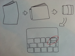
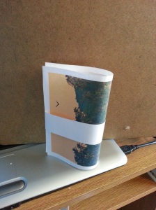
It would have information on it, such as the Title and contents. It would be all the information that litters the (otherwise beautiful) photography of the existing magazine’s front page. This was something I immediately disliked in the initial analysing of it way, and this way I can remove this sleeve and allow the gorgeous cover imagery to really be shown off.

This did mean that the back cover would be folded inwards and would not be seen. So, the back cover cannot have any important elements on it, such as a bar code or any sentences that I may use to “sell” it and make it more appealing.

Finally, in finalising the form of the newspaper-style mag I realised that once the sleeve is removed you may simply throw it in the bin or get misplaced. If this does happen, the reader will need to know information such as issue number and the title. So I should put this on the cover somewhere, but it cannot be over powering at all.

I now have the skeleton of a newspaper-styled magazine to ease the reader into comfort and extract them from their day-to-day lives, thus instilling the experience of Food and Travel. Boom.

Cover Work 01

I was heading down two routes. Firstly, exploring the texture on the front cover as well as inside and the second was a beautifully slick and mature approach of black and whites.

Neither were particularly winning. The sophisticated look was falling down on many levels because it wasn’t coherent with the inside. The textured front gave away any surprise and wonder inside!

What to do?

exphotoI begun to look at expressive photography and how I can make an image imply what is inside, without giving too much away.
I read a bit of ‘Expressive Photography: The Shutter Sisters’ Guide to Shooting from the Heart’ and it says the following:

“Capturing the perfect horizon can be the most inspirational of all photography – as we focus our eye on a seemingly never-ending sky or sea, we look towards the future and all that possibly awaits us there.”

This tells me of the power of photography. Do I even need to enravel myself in design? The right imagery  could speak for itself? It wouldn’t matter if it aligned perfectly with the ever-changing, internal styling of the magazine. But most importantly it wouldn’t give anything away about the surprises in store. What I need is to find a photograph that uses a “seemingly never-ending sky or sea” to suggest a possible future within.

Seems simple enough.

Then, to further complicate the search, I realised that a magazine of this size will be larger than anything else on the shelf. It will need to be folded to be stacked.
I address this issue in the next post…

Living Logo

I wanted to get away from the logo that was already being used because it was like a stamp, with fonts that remind the reader of the ordinary world.

What I mean by this is, Futura, Times New Roman and Minion Pro are all used in the original logo and are all very common and expected fonts, often associated with computers and the digital world.
My concept relies on the reader not being reminded of these things and, as such, I need to change the logo.
I like to think that I’m a trendy guy! And a very popular trend today is something called “living logos” and “flexible identities.” These are logos that are more engaging and adapt to their environments/purpose.
I want my logo to feel like less of a stamp and more of an accomplice to an image.
I won’t completely forget the original logo, after all, it is their identity. But throughout the magazine, if the logo is required I will ensure it fades in.
Below are 3 variations of the living logo, Greek, Saudi Arabian and Oriental:

Logo-Variations-01